
Gabriel White, Introduction to the catalogue for the retrospective exhibition which ran from December 1973 to January 1974 at the Victoria and Albert Museum

Catalogue cover - "Tradesmen's Wives at The Shirland" 1947
Edward Ardizzone, who was born in Haiphong in 1900, is very much an English artist in spite of his Italian name and partly Italian ancestry. Though an admirer of the drawings of Constantin Guys, one can discern little or no foreign influence in his work, which belongs to the long tradition of illustrators of this country including such names as Cruikshank, Charles Keene and Caldecott. Any artistic family background came from the side of his English mother. She had been a watercolour painter, as were so many young ladies of that period, but she, more than most, had studied in Paris and worked in Colarossi's studio in the 188os. Further back, there was an almost legendary descent from a Joshua Kirby, who was a Suffolk man and an artist friend of Gainsborough.
Ardizzone's artistic education was a part-time training, but it was forceful and enduring. He worked for a number of years at the Westminster Art School - alas, no more – in Bernard Meninsky's evening life classes, coming under the spell of a man who was not only a born teacher and a brilliant draughtsman of the human form but one who could inspire enthusiasm in his pupils and possessed a vast store of knowledge, which he was always ready to impart to those whom he favoured. In 1927 Ardizzone left the City firm where he had been working and decided to take up art as a career.
He celebrated his newly won freedom with a tour abroad. Foreign scenes however left little impression upon him and the first inspiration in Ardizzone's work was the part of London in which he had lived since early manhood, Maida Vale, where raffishness verging almost on the sinister jostled closely against a respectable population with a slightly foreign and artistic flavour. Architecturally it is a district divided by wide avenues flanked with trees, and it could boast then of possessing some of London's most rewarding "locals", whether for the company found in them, both racy and seedy, or for the interior decor.
Christmas Eve at the Warrington- Christmas
This ranged from the palatial resplendence of "The Warrington", with its lordly staircase leading to the billiard room above, which figures so frequently in the artist's drawings and paintings, to the cosy frowstiness of little bars tucked away in some quiet back alley. It is these which provide the milieu for so many of Ardizzone's intimate scenes of London life. There, also, were to be found the dingy "bed-sitters" and the sparsely furnished studios, which enshrine so many resplendent female nudes.
But it was not always seamy metropolitan life. There was another vein that can early be found in the artist's work, softer and more idyllic, arising from his frequent descents into the Kentish countryside. First to Eynsford, with its lovely valley which, forty five years ago, was almost as Samuel Palmer knew it, and later to Rodmersham Green near Sittingbourne, with its family connections and where he himself now lives. Its orchards and leafy lanes have constantly inspired him.

Illus. from Blackbird and the Lilac - James Reeves 1952
There was yet a third motif which plays a large part in Ardizzone's oeuvre, the sea and shipping. Knowledge and experience of the sea were in his ancestry on both sides of his family. His father's father had been an Italian sea captain, who lived at Bari and was
a ship owner, and one of his mother's grandfathers had been a Captain Kirby, who left behind him a number of logbooks illustrated by himself.
He visited Kingsdown, near Deal, where his brother David had a house beside the shingly beach and where shipping was constantly passing close in-shore. This was to be the inspiration for the first Tim book, Little Tim and the Brave Sea Captain, in which the Ardizzone house was Tim's home. Ships, sail and steam, small boats, incidents of life at sea and activity on rivers were again and again to provide fruitful themes.
Such were the subjects of many of Ardizzone's pictures throughout his working life, but early in his artistic career came an opportunity to widen his outlook that provided material of sterner quality with a totally different background. He was appointed official War Artist in 1940. From the period in France up to the fall of Dunkirk, during the early London blitzes and Britain's preparations against invasion, to North Africa and the Western Desert and then on to Sicily, ltaly, Normandy and Germany he poured out a long succession of drawings and paintings. He depicts the hardships of civilian life with the sudden interruptions of peacetime existence, the soldiers' training, the frequent periods of waiting and inactivity and then the almost uninterrupted fast-moving warfare of the latter years. Ardizzone was never far behind the battle, and at times he can produce a grim picture of recent fighting. The total output provides a wide survey of human behaviour in times of war, which for its truthfulness parallels the writings of literary recorders such as Stendhal and Tolstoy.
After the war, Ardizzone's subject matter again widens. Though for a number of years he was to continue his "low life" subjects, a world of greater respectability begins to appear, with house parties and bathing pools in the South of France. Records of foreign travel present a life of greater comfort and affluence. Beer in pubs gives place to wine at the dining table, the imbibers may still have red noses, but they are tasting finer products, which are not cheap. Some bite may have gone out of his work, but the social scene isnow richly attractive. In 1962 he was elected A.R.A. and in 1970 R.A.
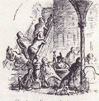
As a constant observer of life around him, Ardizzone was ideally suited for book illustration. In a sense all his work is illustrative, but the power to interpret an author's text is a gift which he possesses in a marked degree, both from his sympathetic understanding and vivid imagination. His achievement in this field lies in his ability to create a series of small events. He does not concentrate as much on the individual characters of the story as make a picture from their behaviour in the incidents which he has selected. Apart from the people in his own children's tales, one lays down the book with perhaps no extended knowledge of the hero or of the other protagonists, but with a memory enriched by a number of lively scenes. His first book, Sheridan Lefanu's In A Glass Darkly, 1929 (no. 78) was an outstanding achievement and it establishes his particular style.

Illus. from In a Glass Darkly, Sheridan Le Fanu 1929
Here the drawings however are more linear than they were to become, the background and other details are more sketchily depicted so as leave the emphasis on the figures. The contrasts between black and white are sharply expressed, and this creates a vivid dramatic quality. The force of the drawing lies in its composition, which is striking and full of movement and no accessories are allowed to diminish the impact.
Later he would work to achieve greater atmosphere and more depth. The useof varying greys produces drawings of much finer delicacy. He has recourse to cross-hatching and though he may lose some forcefulness his drawings are more complete in what they tell, and at the same time have acquired a greater power of suggestiveness. We can imagine more than we see.
In the pre-war period two other books were specially successful; The Local, 1939, written by Maurice Gorham, with coloured lithographs drawn on the stone by the artist, and My Uncle Silas, by H. E. Bates, also 1939, with illustrations in heavy black line and which begin to dwell more on landscape and background.
To the general public Ardizzone is best known as an illustrator of children's stories, but it would be wrong to regard him primarily in this role. His children's books are among his happiest achievements, but they only employ a part of his remarkable talent. His naiveté made him obviously suited to be a children's illustrator. He was again helped by the memories of his own childhood (which he records through somewhat rose-tinted glasses in The Young Ardizzone, 1970), and his personal taste in juvenile books as a boy, when he preferred plain narratives such as Bunyan's Pilgrim's Progress. The drawings are remarkable for their clarity, the colours are gay, the ships are correctly rigged and no artistic consideration is allowed to confuse the narrative. It is these same qualities, straight-forwardness and simplicity, which make him so enjoyable a writer. Before the war, with two children of his own, story telling was naturally in demand, and this was a gift he had inherited from his mother. So his illustrated tales began with Little Tim and the Brave Sea Captain, 1936, followed by Lucy Brown and Mr. Grimes, 1937, which had for its scene the Paddington Recreation Ground, with its bicycle track, that was nearby and where the children played.
For reasons of space it has been possible to include only a small selection of his illustrated books. The choice has been highly selective and out of a total of over 150 works there are a bare 20, of which 12 are children's tales.

Baggage to the Enemy
Baggage to the Enemy, 1941, an illustrated account of his life with the British army in France up to the fall of Dunkirk, was published in 1941. Here the illustrations still retain the simple dramatic quality of his first book.
After the war came Peacock Pie, 1946 (no. 83), a book of rhymes by Walter de la Mare, in which Ardizzone had been preceded as illustrator by W. Heath Robinson, C. Lovat Fraser and two others. Though a peacetime production, the drawings had been made in Italy during the war. As Brian Alderson says in his Preliminary hand list of Ardizzone's illustrated books, 1929 to 1970 (The Private Library, second series, Volume Vi, Spring1972), "There is a general agreement that Edward Ardizzone's work shows a particularly sensitive response to the character of De la Mare's verses and this edition bids fair to become one of those children's classics, whose pictures are regarded as inseparable from the text". This was followed by The Poems of François Villon, with the artist's
Coloured lithographs, Trollope's The Warden, 1952 (no. 85) and Barchester Towers, 1953, and another example of specially happy collaboration between artist and author in Eleanor Farjeon's The Little Bookroom, 1955 (no. 86), these last three being illustrated in line. The Tim stories continued, and finally numbered nine*works, ending with Tim’s Last Voyage, 1972 (no. 96). Ardizzone was frequently called on to illustrate many of the English classics by authors such as Shakespeare, Bunyan, Dickens and Thackeray. In a few of these the memory of previous illustrators must have been somewhat inhibiting, and he is never quite as much at ease in costume previous to the seventeenth century, but his Pilgrim’s Progress, 1947, and Robinson Crusoe, 1968 (no. 92) show the artist's skill and sympathetic understanding of the text at its best. To conclude this frankly personal list, and other aficionados would have a different choice, mention should be made of The Young Ardizzone, 1970 (no. 94) which is an engaging autobiography bringing the story of his life up to his marriage in 1929 to Catherine Anderson, whose face and figure were to be an inspiration to him in so many of his pictures. It has a somewhat sketchy conclusion which brings the narrative up to the outbreak of war in 1939. In this book his drawings of himself and his sisters and other members of the family show how often they have been the source material of previous illustrations.
It is sometimes said that there has been little development in Ardizzone's style. It is hoped that this exhibition will demonstrate that both in manner and subject matter this is untrue. There is a backward-looking flavour in all his work, and this is a characteristic not unknown in other illustrators. The Edwardian scene, with its richly varied cast of relations and other colourful characters provided his earliest impressions which never quite ceased to influence him. Contemporary thought hardly impinges on his style and except in some aspects of the war he shows no desire to portray the technocratic world we live in. Naturally much of the development of contemporary art with its steady advance to abstraction and anti-art must have been unsympathetic to him. His aim was unashamedly to illustrate, and he shared a place with other contemporaries in the move away from pure formal art. Ardizzone's is an intensely personal style, you must share his own tastes and enjoyments. His world is cushioned on the pleasures of life, food and drink, bathing and boating. There is a penchant for easy curves, whether the rotund thighs of a model (male models are rare in his studios and art rooms) or a bowed man's back. Convexity and comfort abound. But the pleasures are by no means all physical; himself a wide reader, libraries and seated readers figure among his

Illus: The Little Bookroom, Eleanor Farjeon 1955
most attractive drawings, and listening to music can evoke a charming picture (no. 58). We are spared introspection, the drama is of the simplest and there are no Freudian undertones. He is no fierce caricaturist, and his humour - though he is not primarily a humorist – is sometimes very simple. But withal there is a true sympathy and humanity with a keen sense of the character of what he sees, however trivial - sometimes perhaps because it is trivial.
Technically also the artist's style has matured. The emphasis, as we have seen, was first on line and the drawing was conceived in black and white. If there was to be colour it was an addition, penny plain tuppence coloured. Later, however, came a more subtle conception. Line and colour fuse more closely, and one becomes hardly aware of the pen which is employed to add accents to the brushwork. In his painting, apart from his illustrations, the colours tend to produce a suffused tone with greater power to render atmosphere and sometimes suggest mystery. Though he continued to use a basic tint, generally Payne's Gray, line, tone and colour are successfully blended. With the years the line becomes even more broken and the whole technique loosens.
The strong personal note in the artist's work must in part be derived from his use of note-books, note- rather than sketch-books, of which every year adds to the already large quantity. More often than not, you will find one in his hand, like a lay breviary. These are provided by a constant supply of book dummies, and in these he will jot down something observed, or record a passing fancy, a few lines or a highly wrought drawing. It is a distillation of these that provide the new material of his work, though often his power to grasp a scene as a whole makes it possible for the sketch to be made directly into a picture.
Christmas card: The Artist in his Studio c.1950
In his studio, perched on a model's throne, he would sit at his desk as we see him in no. 114. A large window beside him looked on to Elgin Avenue, and through the trees he could see the houses opposite with their bed-sitters and the life in the street below, while he himself was to become a landmark to the passers-by. The long sequence of Christmas cards, which began in the early years of his career, are full of incidents provided from this vantage point. There he would pour forth drawings and illustrations, for he is the most prolific of artists. Rarely is he to be found away from his desk and rarely can he say no to a request for another illustrated book.
Frequently the notebooks would become a diary. The blood of Captain Kirby with his illustrated logbooks was in his veins, and he felt the need for a verbal link to his visual jottings. The earliest of these must have been the diary of a visit to Dieppe, which he made with his brother David and Barnett Freedman. This had been commissioned by Oliver Simon, and was published by him in Signature (no. 13 new series, 1951) with an introductory article by Lynton Lamb. This was in the tradition of Hogarth and his trip to the Isle of Grain in 1732, but the amusements of the Dieppe party were more decorous and were mainly gastronomic. His most ambitious attempt in this field were the War Diaries, which have only recently found a publisher, and which will be produced next year by The Bodley Head. Often the little sketches in these became the subjects for his war paintings - and a drawing on the page opening which it has been possible to include in this exhibition (no. 127) can be compared with the final version in watercolour (no. 29). Later there are diaries of a visit to India in 1952, when he was commissioned by UNESCO to attend a seminar for the production of audio-visual aids, followed by another of a visit to Australia in 1968. Volumes from these are shown here (nos. 116 and 125). Lastly, his inability to resist the urge to embellish his text with drawings emerges in his illustrated letters, of which nephews, nieces, grandchildren and numerous friends were the fortunate recipients. Artists alone of his friends do not receive them, "You don't illustrate letters to artists" is the rule.
Though artistically less important, no Ardizzone exhibition would be complete without some reference to his commercial work. For this, with a passing glance back to Hablot Browne, he devised the signature DIZ. His first commission was from Johnny Walker and was the least successful, but it brought him a handsome sum of money at a much-needed moment and the opportunity to spend a week in Brighton in some luxury. But other commissions were more fruitful despite Ardizzone's own disclaimer "that he would never be a successful advertising artist". Shell, through Jack Beddington, British Lion films through S. John Woods, and Guinness were among those who employed him. But on the whole the scale of poster work does not suit him, there is no place for the restraint and subtlety which is characteristic of his finest work, with bold and broad treatment he loses some of his charm. The full flavour of his style can only be savoured in his smaller and more intimate things, such as the illustrations to a wine list (no. 104) or the vignette for the title page of John Lehmann's London Magazine.
Ardizzone has on the whole been well served by his printers. Some of these, for his line work especially, have achieved notable productions, such as A Stickful of Nonpareil, 1956, privately printed at the Cambridge University Press, and a simple presentation of a less sophisticated order The Milldale Riot, 1965 (no. 89) published by Ginn & Co. Ltd. When comparing the original drawing and the printed illustration, it is interesting to see occasionally how much the latter has gained in depth and in greater richness. The artist, by intentionally keeping his drawing dry in line and tonally flat, has allowed for the thickening up of the line in the printing process. In colour work the standard is far more variable. The earlier Tim books before the war, whilst the colours may not always be true, were gay and attractive productions. A fine example of colour work was Henry Esmond, 1956, printed for the Limited Editions Club by John B. Watkins & Co. New York, and prepared for press by John Dreyfus of the Cambridge University Press. The illustrations were hand coloured, a technique that could still be employed in the United States after it had become commercially extinct in England. Folk Songs of England, Ireland, Scotland and Wales, 1961, published by Doubleday and Co. Inc. New York, can also be picked out for its good two-colour line printing.
Some books were illustrated by the artist's own lithographs. This was a reproductive process that he found specially congenial. He has also produced a number of lithographs for himself that were never published, but which add considerably to the general appreciation of his work. Whilst for illustrations and other commissions colour lithography was employed, he himself preferred black and white. In these he could produce subtle and delicate effects from the rich blacks and his fine sense of gradation in the use of grays. He also produced two black and white lithographs for Trinity College, Oxford, printed by the Curwen Press (no. 75) and others for a series on English public schools, published by Editions Alecto (no. 76).
This exhibition attempts to give as comprehensive a view of the artist's work as possible. Stray ventures into other techniques include two oil paintings, a medium which he abandoned early though the output was large for a period of two or three years, decorations on china, small terracotta figures, four of which were exhibited at the Leicester Galleries in 1951, and one etching of which he produced only about six. Though there is a strong personal note in all his paintings and drawings, the lighter side of his character can be best appreciated in his illustrated letters and in his own Christmas cards, a number of which are shown here.
Letter to a Grandson 1973
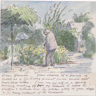
Ardizzone has now moved out of London and built himself a new studio, which stands in his cottage garden. Much of the old atmosphere has moved with him, but the outlook has changed: in place of Maida Vale facades he now looks out on rose bushes and fruit trees, but there by the window he can still be seen working away.
Reprinted by kind permission of the Trustees to the estate of Gabriel White
© The Estate of Gabriel White 1973
* One further Tim book was to follow - Ship's Cook Ginger in 1977 - and there are, in fact eleven Tim books in all - See books currently in print page
Return to top of page
Copyright © 2008, Estate of Edward Ardizzone All rights reserved. - quentinclemence@gmail.com